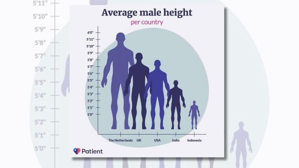

The graph's y-axis did not start at 0, creating a false perspective of what the average male height was in the selected countries. However, some of the numerical height values included in the graph were accurate.
In October 2023, an image was shared on X (formerly Twitter), allegedly comparing the average male height per country, that received over 2 million views. "The scale is shockingly inaccurate," one comment under the post read. As one could see, the graph suggested that an average male from the Netherlands was about three times taller than an average male from Indonesia, which to many seemed ridiculous.
— ShitpostGateway (@ShitpostGate) October 17, 2023
We started our research by looking for the source of the image with TinEye and Google reverse-image search tools. TinEye search results indicated that the image was first found on Reddit in a post published on Dec. 12, 2022, with a caption of "So many things wrong with this," suggesting that it was a repost rather than an original publication.
So many things wrong with this
byu/TheMooRam inmildlyinfuriating
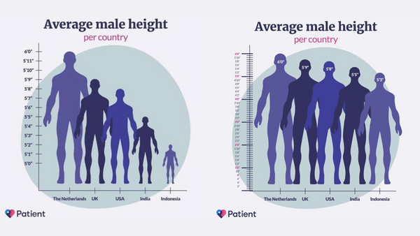
The most viral post with the image was shared by @BadDataTakes account and reached over 4.5 million views on X. "Hey, someone fixed the infamous height chart!" another sarcastic post on X read, attaching an altered version of the graph with an attempt to correct the proportions.
Hey, someone fixed the infamous height chart! pic.twitter.com/LSoG8DrbFa
— Journal of Astrological Big Data Ecology (@JABDE6) August 14, 2023
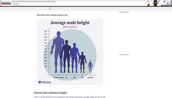
We then attempted to find the "Patient" organization whose logo is featured in the lower left corner of the chart. We found an article on the topic, featuring the same logo, published in November 2022 with the title, "What's the average height for men?" on the patient.info website. "Height has been linked to life expectancy, diseases, and even educational and financial success. How do you measure up against the average height for men in your country? And what can your height and waistline tell you about your health?" the article asks.
"This is the quality of chart you would expect to be published on a dot info domain. Someone paid someone else money for this and thought it was a perfectly fine way to visualize data. I mean, where to begin," one X post on the topic read, underscoring that the website's domain name could falsely create a sense of credibility.
However, the version of the graph we found on patient.info (on the right, below) significantly differed from the one shared by various social media users (on the left). The two main differences were the fact that the graph in the patient.info article included the y-axis starting at "0," and the fact that the male figures' relative proportions were therefore much more accurate.
(X user @ShitpostGate, patient.info)
We used the Internet Archive's Wayback Machine to see if the patient.info article had been modified and we found a version of the page archived in December 2022 that, to our surprise, included the misleading graph.
(Wayback Machine, December 2022)
However, even the somewhat proportional version of the graph (archived) has been criticized online. For instance, one of the RPubs' users pointed out three main issues: the lack of sources for the presented data, the misleading visualization methods, and the unclear y-axis labeling:
The visualisation chosen had the following three main issues:
- The first issue with the selected visualisation is that the parameters and context of the taken data and its measurements are ambiguous. For instance, the visualisation does not provide any source or methods used to collect the data as well as its unclear, whether the average metric is a mean, mode or median. Furthermore, it is unclear why certain nations were chosen for display or why they were arranged in what appears to be descending order of height.
- The second issue with the selected visualisation is Colour and perception of scale. For instance, adopting a male gender sign in place of bars can be confusing and counterproductive. It is impossible to distinguish between the heights of male in UK and USA due to overlapping male gender sign and usage of various blue hues serves no purpose in informing the viewer of anything.
- The third issue with the visualisation is with labeling on y axis. It’s unclear from the y-axis term “height” whether centimetres, feet, or inches are being utilised as the unit of measurement.
All in all, the graph was constructed in a way that misled readers, and did not provide the sources for the average height values. We found that some of the height values given were accurate, although their publication dates differed. Therefore, we have rated this claim as "Mostly False."
The example of the average male height per country graphs shows how deceptive such visualizations can be. If you find a suspicious graph on social media, feel free to send it to us so we can fact-check it.