In July 2022, as much of the world experienced intense heat waves, many social media users attempted to downplay the extreme weather trend by accusing meteorologists of exaggerating the hot temperatures with scary-looking weather maps. A series of before-and-after images supposedly comparing years-old TV weather maps with current weather maps were shared online along with the claim that the maps, not the temperatures, were getting scarier over time:

Television weather presenters are not fear-mongering with exaggerated weather maps. The above-displayed comparisons are misleading, as they cherry-pick moments from years-old broadcasts and compare entirely different types of maps. More importantly, meteorologists design these weather maps to quickly and effectively communicate information to the public, not to scare or deceive people.
Dave Herring, of the National Oceanic and Atmospheric Administration (NOAA), told us that weather communicators have been "increasingly using colors" to make maps more intuitive to non-weather specialists. These changes, Herring said, aren't to "trick anyone or make [the weather] seem scarier; rather, the point is to make it more relatable to the variable being shown, so that it's more intuitive to the lay public and easier to understand."
Herring said in an email:
Communicators in general — including broadcast meteorologists — have been increasingly using colors that are representative of the variable(s) they're showing in order to make their maps more intuitive to non-specialists. For example, using 'cool' tones (blue, purple and white) to show areas where there are very cold temperatures; and using "warm" tones (yellow, orange, red, dark red) to show where there are hotter temperatures. We see similar strategies in other maps too, such as very heavy rains and sea level change / flood maps — using a graduating scale of blue hues to show increasing amounts of water.
We've Seen These Types of Accusations Before
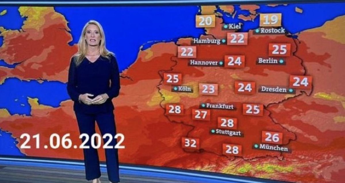
This isn't the first time that weather presenters have been falsely accused of fear-mongering with "exaggerated" weather maps. Take the pair of images on the far right of the above-displayed collage of disingenuous map comparisons, for example. This image pair circulated in 2019 along with the same sort of accusations that surfaced in July 2022 -- that the maps are intentionally being made scarier in order to push the idea that there is a climate crisis. The comparison is of two different weather maps that were broadcast at different times by the German news program "Tagesschau."
The network addressed the accusations in 2019, explaining that the image compared two different types of weather maps. The top was a temperature forecast that used a range of colors to give viewers an estimation of how hot it would be in a given area. Meanwhile, the bottom map came from a multi-day weather outlook that gave viewers more information than simply the high temperatures for the day; it also displayed data about cloudiness, precipitation, and sunshine. Because of that, this information was displayed on a neutral-colored map.
Tagesschau wrote at the time (translated from German via Google):
The top map [...] is a temperature forecast. The coloring allows you to guess how high the temperatures will be, even where there is no number. The scale can range from dark red for hot temperatures to cold blue. [...]The lower map in the graphic distributed on Facebook, on the other hand, is the outlook for the next three days, which not only shows the temperatures, but also information about cloudiness, precipitation or sunshine. This information is stored with a neutral map.
The Evolution of Data Visualization and Weather Maps
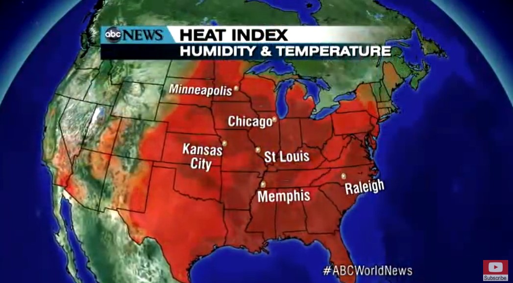
The above-displayed images do not involve apples-to-apples comparisons. The older maps come from instances in which weather presenters were using neutral maps and talking generally about weather conditions (wind, rain, sun, clouds, temperature, and so on), while the images of recent maps come from moments in which weather presenters were specifically describing heat. A more honest comparison of how weather maps were used during heat waves in previous years would feature two images of maps that were used to illustrate heat waves. While it should be noted that there isn't a set global standard for weather map design, we found several examples of years-old weather maps that used "scary" red colors to illustrate excessive heat. For example, here's how ABC illustrated a heatwave in 2012:
While the color red has been used to illustrate extreme heat for years, weather maps truly have evolved to better communicate data to a general audience. These changes in how data is visualized are made for a number of different reasons. In 2017, for example, so much rain fell during Hurricane Harvey that the National Weather Service (NWS) had to update its color scheme:
After the NWS altered their color scheme to better reflect the vast amount of rain that fell during Hurricane Harvey, a number of climatologists voiced their displeasure with the change, arguing that the map could have been more accurate if the NWS ditched the outdated "rainbow" color scheme. Weather maps have relied on a rainbow color scheme for centuries, but some climatologists argue that these maps can be difficult to read for people who are color blind and that there are more accurate ways to visualize weather data.
The decision has proven surprisingly controversial, at least by data science standards. That's because rainbow color scales are a persistent burr in the saddle of the cartographic community — an issue that so irks some data scientists, it has its own pejorative catchphrase: End the Rainbow, or #endtherainbow or #endrainbow.
Their argument? Using a rainbow color scheme to explain science is exclusionary, and oftentimes unnecessarily misleading. And in a time when the truth about climate change and other scientific issues needs to be communicated forcefully and clearly, poor design is unacceptable.
In July 2022, the United Kingdom's national weather service, the Meteorological Office (or Met Office), addressed the accusation that it was scare-mongering with its weather maps. The MET explained that while it had made some changes to its weather maps over years to help people who are colorblind interpret the data, these changes were made to better communicate information about the weather, not to scare people. Reuters reported:
Professor John Marsham, Met Office joint-chair at the University of Leeds, told Reuters via email the adaptations had been made to help people living with colour blindness.
He said: "The (Facebook) post is misleading as it claims the Met Office has changed its colour schemes so that temperatures which before did not look scary now do. In fact, it was actually done for colour blind people."
Memes, Harassment, and Climate Change Denial
During the July 2022 heat wave, in addition to creating and spreading misleading memes in an apparent attempt to downplay, discredit, or deny the climate crisis, some people sent harassing messages to weather professionals. The BBC reported that weather forecasters experienced "unprecedented trolling" as they tried to communicate to the public that the world was experiencing more intense and more frequent heatwaves. The BBC reported:
The BBC's team received hundreds of abusive tweets or emails questioning their reports and telling them to "get a grip", as temperatures hit 40C. BBC meteorologist Matt Taylor said he had never experienced anything like it in nearly 25 years working in weather. [...]
Other tweets accused the Met Office and the BBC of spreading "alarmism" and "hysteria", telling both to "stop scaremongering". Hundreds of people have also shared their experiences of the 1976 heatwave on social media, with many making the false suggestion that this month's heatwave was "no different".
The peak temperature in 1976 was 35.9C, more than four degrees lower than the 40.3C recorded on 19 July. Nine out of 10 of the hottest days ever recorded in the UK have been since 1990, according to the Met Office. The hottest day from 1976 ranks as 13th in the list of the hottest UK days on record.
When we asked NOAA to comment on the recent rumors that weather presenters were fear-mongering about the climate crisis, they emphasized that weather maps are created to effectively communicate information — not to purposefully scare anyone. These map comparisons may incorrectly lead people to believe that it is the reporting that is getting more extreme, not the weather. But, in fact, 19 of the 20 warmest years in recorded history have occurred since 2000.