
Readers who have searched social media for information regarding the 2020 Summer Olympics in Tokyo may have come across an image graphic supposedly showing the official logo for that quadrennial competition:
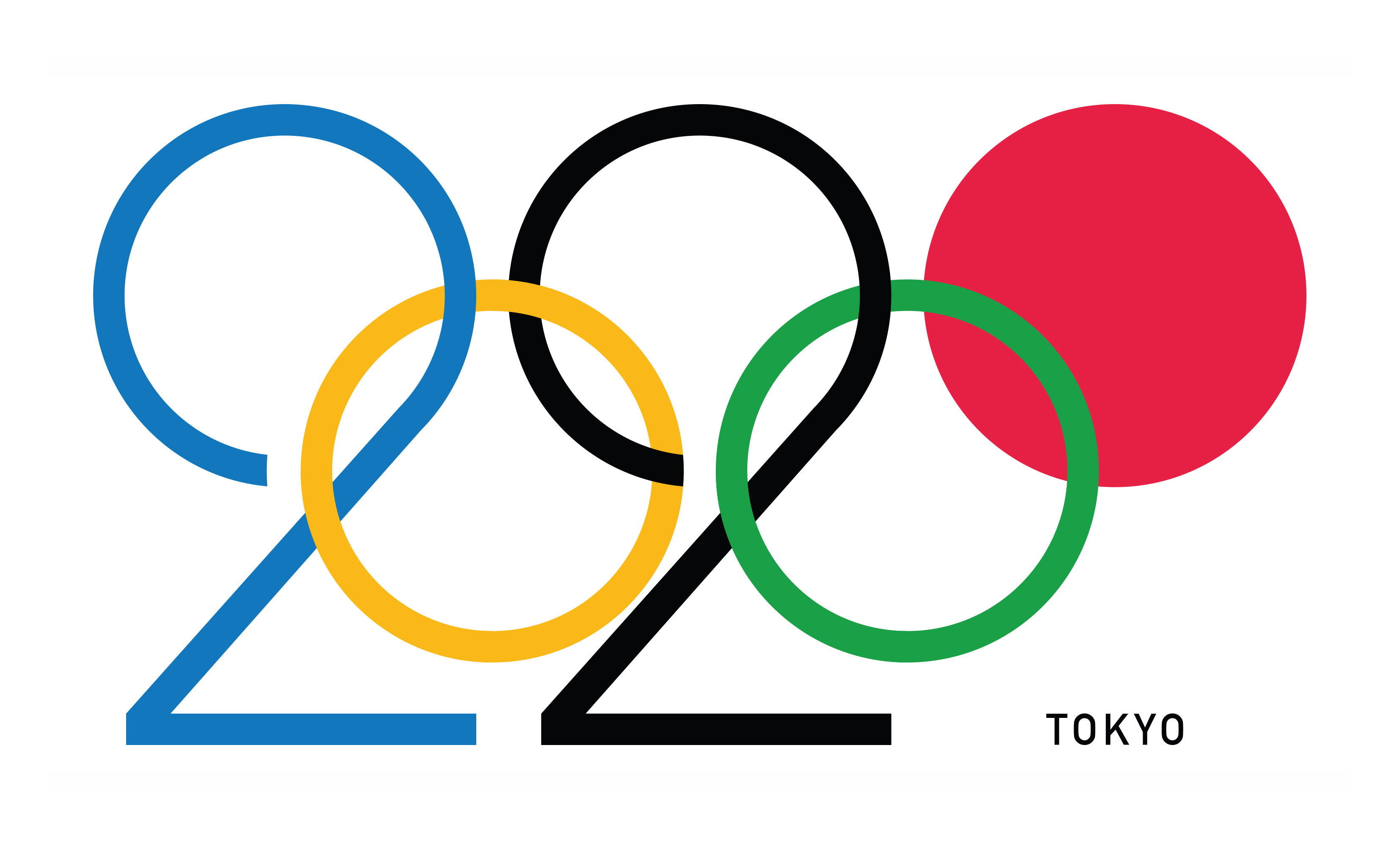
On July 17, 2019, for example, this image was shared on Reddit under the caption: "The 2020 Tokyo Olympic logo is a masterclass in design." This image is so frequently shared as if it were the official 2020 Summer Olympics logo that it even popped up as the first search result in Google:
![]()
This is not, however, the official logo for the 2020 Summer Olympics games, but rather an unofficial concept logo created by graphic designer Daren Newman:
#lettering Idea for @tokyo2020 #MeAndMyPen #Olmpics #Tokyo #2020 #Tokyo2020 https://t.co/aCs13sr78I pic.twitter.com/0CWbo6UY5o
— Daren Newman (@DarenNewman) June 19, 2019
Newman told Creative Bloq he was surprised by the popularity and ubiquity of his logo concept:
The massive reaction took Newman by surprise. "I just put it out there on my Instagram feed expecting it to just get lost in the sea of other posts," Newman tells Creative Bloq, "but the opposite happened and it has since gone a bit bonkers!"
"I’ve had people getting in touch with me from all over the globe. I wasn’t sure why this was happening, and then a few people got in touch to tell me it was on Reddit and it had created a bit of a storm. And then a fair few people on Twitter started reposting it!"
"There has been a lot of positive response to it which is great. There have also been a fair few negative responses, which I’m more than willing to accept – I’m just overwhelmed with the response to it."
The official 2020 Summer Olympics logo was designed by Asao Tokolo and features a checkered pattern of three different-sized rectangular shapes. The International Olympic Committee (IOC) explained this design "represents different countries, cultures and ways of thinking. It incorporates the message of "unity in diversity." It also expresses that the Olympic and Paralympic Games seek to promote diversity as a platform to connect the world":
Chequered patterns have been popular in many countries around the world throughout history. In Japan, the chequered pattern became formally known as “ichimatsu moyo” in the Edo period (1603-1867), and this chequered design in the traditional Japanese colour of indigo blue expresses a refined elegance and sophistication that exemplifies Japan.
The organizers of the Tokyo Olympics unveiled the above-displayed logo in April 2016 after accusations of plagiarism forced them to scrap their original design choice.