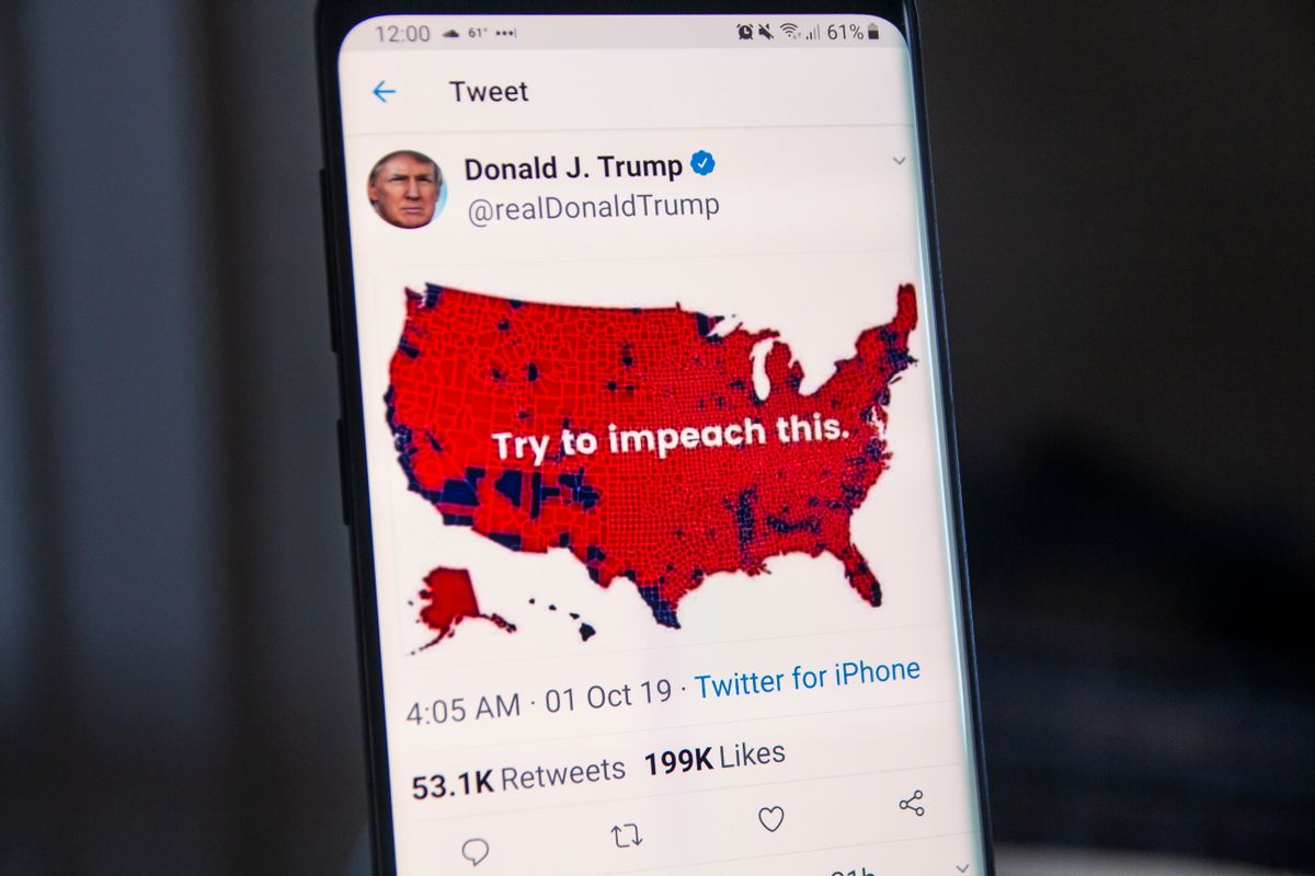
On Oct. 1, 2019, shortly after U.S. House Speaker Nancy Pelosi announced the start of an official presidential impeachment investigation, President Donald Trump tweeted a map supposedly showing the results of the 2016 election with the words "try to impeach this" written across it:
— Donald J. Trump (@realDonaldTrump) October 1, 2019
The president appeared to be arguing that he has so much support across the country (illustrated by the large swaths of red on this map) that efforts to impeach him would be futile. However, this map is both inaccurate and misleading.
What does this map show?
This is an outdated and inaccurate map of the county-by-county results of the 2016 election. It seems that this map can be traced to an article by Max Galka on Metrocosm about how election maps can be misleading.
Galka's critique of that map was originally published just nine days after 2016 presidential election. But since it can take weeks, or even months, for counties to certify their election results, some of the counties on the map were mislabeled.
As CNN reported:
The Clinton-won counties the map wrongly shows as Trump-won counties include Orange County, California; Washoe County, Nevada; Lake County, Minnesota; Gallatin County, Montana; and Whitman County, Washington ...
... One possible reason this map did not reflect the final results: correct county-level results data can take a long time to come in. Certain states are not able to provide complete information until long after the election. "Some states don't certify their results until over a month after the election," says Harry Enten, a CNN senior analyst who specializes in data-driven journalism. "So any county-by-county map that looks at returns within a few weeks of the election is susceptible to potential errors."
The version of this map on Metrocosm has since been updated. However, the outdated version of this map continued to circulate and eventually landed on Trump's Twitter feed.
A more accurate version of this map is reportedly hanging in the White House:
Spotted: A map to be hung somewhere in the West Wing pic.twitter.com/TpPPDyNFtE
— Trey Yingst (@TreyYingst) May 11, 2017
Did the vast majority of Americans support Trump during the 2016 election?
This map may give viewers the impression that the vast majority of Americans supported Trump during the 2016 election. After all, the vast majority of this map is colored red and not blue. But that isn't the case. In fact, when this map was originally published on Metrocosm, it was included in a section entitled: "Election maps are telling you big lies about small things."
Galka wrote:
The typical red/blue election map is in some ways deceiving. The one below shows the county-level results for the 2016 election. To look at all the red it would appear Republicans dominated the race. In reality, Democrats received a larger share of the popular vote.
As with most maps that represent information using color, red/blue election maps are great for communicating categorical data (in this case, which candidate won county X?). But they don’t do a very good job conveying magnitude (how important is county X compared to other counties?).
For example, L.A. County alone has a population of over 10 million. That’s more than the combined population of 10 entire states. Maine, New Hampshire, Rhode Island, Montana, Delaware, South Dakota, Alaska, North Dakota, Vermont, and Wyoming together have a total population of just over 9 million.
Trump won the 2016 election with 304 electoral votes, compared to Hillary Clinton's 227. Trump also won far more counties. According to the Associated Press, Trump won 2,626 counties compared to Clinton's 487. Counting counties may not be the best way, however, to show overall support, as some counties have vastly more people in them than others. Despite only winning 487 counties, Clinton won the overall popular vote by more than 2.8 million votes.
Is Trump too popular to impeach?
Trump seems to be implying that he is simply too popular to be impeached. However, a number of flaws to that argument exist. In addition to the reasons stated above about why this map is misleading, it is also several years old and does not necessarily reflect the current attitudes of voters because popularity of a president fluctuates throughout a term in office. In other words, a presidential election map from 2016 is not the best way to indicate a president's popularity in 2019.
Second, while the popularity of a president may come into play while making the political decision whether to impeach or not, a president's popularity is not a legal defense against this action. The Constitution states that "the President, Vice President and all civil officers of the United States, shall be removed from office on impeachment for, and conviction of, treason, bribery, or other high crimes and misdemeanors." There is no clause in the constitution exempting a president from these rules due to popularity.
In fact, if we look at the two most recent impeachment investigations, those of President Richard Nixon and President Bill Clinton, we see that popular presidents can indeed be impeached. Nixon won the 1972 election in a landslide, taking more than 60% of the popular vote, 520 electoral college votes, and carrying every state but one. The county-by-county election result map from 1972, just as the election result map shared by Trump, shows large sections of the country covered in red:
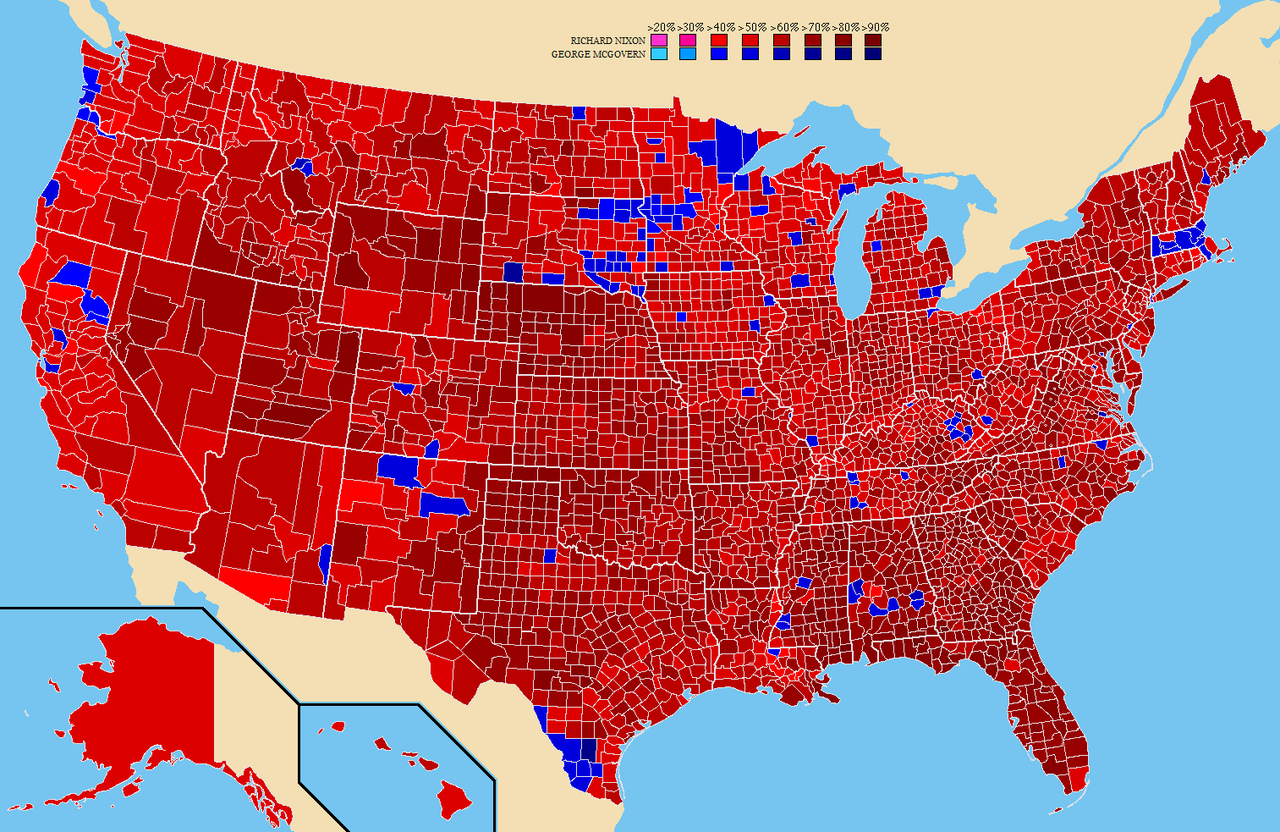
This map did not stop lawmakers from opening up an impeachment investigation into Nixon. While Nixon was never actually impeached, he resigned office in August 1974.
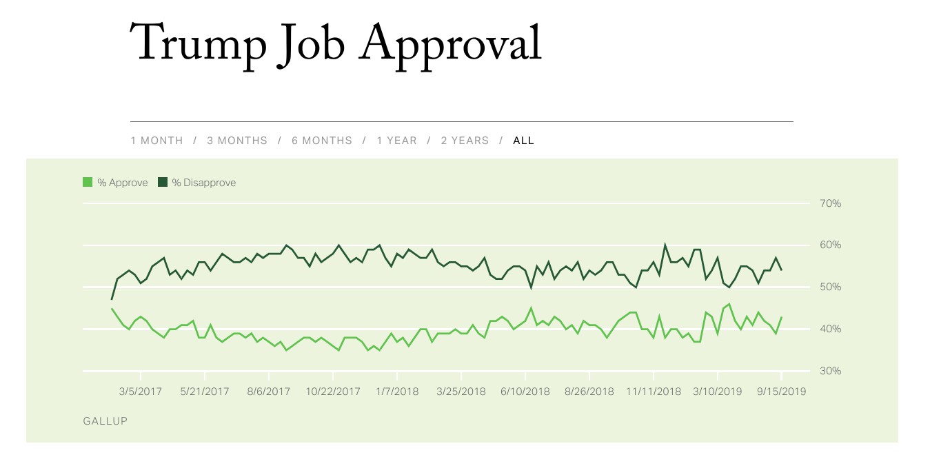
Clinton's job approval rating ranged from the high 50s to the low 70s during his second term in office. Despite the fact that the majority of people approved of Clinton's performance, he was impeached by the House of Representatives in December 1998.
Popularity is not a legal defense against impeachment. Even if it were, it's unclear whether Trump could make that argument. He did not win the popular vote (like Nixon) and his approval rating has never been above 50% (unlike Clinton's) on Gallup: