
Claim: Chart shows an "interesting look at world leaders" during World
Example:
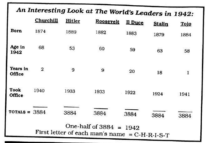
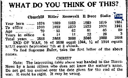
Origins: Charts like the one displayed above were to World
identical numerological patterns associated with the political leaders of the major powers involved in World
Like most such items, however, these items were little more than parlor tricks, a combination of forced results and selective presentation of data.
These charts rely on the mundane arithmetic principle that the year in which an event occurred, added to the number of years that have elapsed since that event took place, will always produce a value equaling the current year. Using the first chart as an example, we note that for anyone alive in 1942, the year of his birth added to his current age (at the end of the year) would necessarily produce a total of 1942. Likewise, for any office-holder in 1942, the year he took office added to the number of years he had held that office would necessarily produce a total of 1942. The charts obscure this gimmick (which amounts, in every case, to simply adding 1942 to 1942) by presenting four different numbers in each column which are guaranteed to add up to 3884, then halving that sum to produce a result that cannot be anything other than 1942.
Similarly, the set of first letters of the surnames of each man included in the chart (C,H,M,R,S, and T) can't be made to spell out anything in English without fudging the data, so the head of Italy's government is listed not by his name, Benito Mussolini, but by his title
The supposed predictive power of these charts to identify when the war would end didn't pan out either, with successive versions of the charts positing dates (typically
Last updated: 19 January 2012