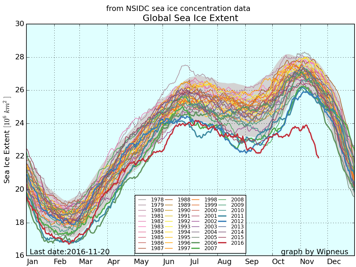

On 16 November 16 2016, University of California at Irvine Ph.D student Zack Labe tweeted an image of a graph, which purported to show a daily time series of the extent of Earth’s global sea ice for every year since the data first became available in 1978–1979.
The graph, which generated numerous shares and retweets, appears to show that for the period beginning around October, the area of global sea ice has never been as low for this time of year as it is now. This chart has since generated spirited online debate over its authenticity as well as the utility of its presentation.
The graph in question was created by a user named Wipneus in the climate message board the “Arctic Sea Ice Forum.” That user documented the source of the data and the methods used to analyze it here. The numbers come from a set provided by the National Snow and Ice Data Centers, which is generated daily from observations from two satellites, NASA’s Nimbus-7 and and the Department of Defense's Defense Meteorological Satellite Program. While the image itself was not created by an official governmental organization, the data — which are publicly available — are accurate.
Experts at NASA’s Goddard Space Flight Center have also noted the same trends, as reported by CNN:
"It looks like, since the beginning of October, that for the first time we are seeing both the Arctic and Antarctic sea ice running at record low levels," said Walt Meier, a research scientist with the Cryospheric Sciences Laboratory at NASA's Goddard Space Flight Center, who has tracked sea ice data going back to 1979.
While the image that Labe tweeted was of a metric called global sea ice area, Winepus has also produced a similar graph using a different metric called sea ice extent. The trends for both are broadly the same, but sea ice extent yields higher estimates because it has a lower threshold for what constitutes an ice-covered grid point on a globe.
The first thing to be aware of with this graph is that it is not the kind of analysis that climate researchers usually plot. As reported by Jeff Masters on the Weather Underground’s WunderBlog, the NSIDC usually plots both hemispheres separately:
“At NSIDC, we generally frown on the practice of looking at the global sea ice extent,” said Mark Serreze, director of the National Snow and Ice Data Center, “the reason being that ice in the two hemispheres tends to behave rather differently; while Arctic extent shows clear downward trends in all months, the pattern for the Antarctic has been much more complex.”
The overall shape of the combined plot presented by Winepus shows the cumulative contribution of the sea ice in both the Antarctic (which typically reaches its highest extent in the Northern Hemisphere summer) and the Arctic (which typically reaches its highest extent in the Northern Hemisphere winter). The reason for the dramatic divergence this year is that the Arctic and Antarctic are both experiencing anomalously low conditions at the same time — a rare occurrence.
Most experts agree that the cause of the low sea ice in each hemisphere is likely caused by different phenomena. This year has been especially warm in the Arctic, both in terms of air temperature and sea temperature, as reported by CNN, which is in line with a decades-long trend of reduced sea ice:
October and November are typically a time of rapid ice gain for the Arctic region, as daylight hours become shorter and shorter and eventually non-existent during what's referred to as the "polar night." Air temperatures plummet to below zero degrees Fahrenheit and parts of the Arctic Ocean not covered with ice quickly become covered. But this year, those air temperatures are staying much warmer, closer to the freezing mark of 32 degrees Fahrenheit.
To make matters worse, the water temperatures in the Arctic Ocean are several degrees above average, which is an expected result of having less sea ice. With less ice in the summer, more of the sun's rays can heat the darker water, as opposed to being deflected back into space by the white ice cover. The result is a feedback loop, and one that scientists have warned about for some time.
The more unexpected finding is the loss of sea ice in Antarctica at this time. Unlike the Arctic, Antarctic sea ice has generally been increasing year to year over the past couple of decades, despite overall warming trends globally.
The Antarctic, as a system, is nothing like the Arctic, due to the open ocean circulation around Antarctica, a lack of land masses, and other factors that make understanding its trends difficult to explain. This finding was discussed by Antarctic climate researchers in a September 2016 post on The Conversation:
To our south, Antarctica has also just broken a new climate record, with record low winter sea ice. After a peak of 18.5 million square kilometres in late August, sea ice began retreating about a month ahead of schedule and has been setting daily low records through most of September.
These authors suggest factors that may play a role in the reduced sea ice, including changing wind patterns and warmer sub-surface ocean water rising to the surface, but they ultimately conclude:
Antarctica’s climate remains a puzzle, and we are currently trying to see the picture with most of the pieces still missing.
The final questions of the debate are how valid it is to present global sea ice trends for both hemispheres in the same graph, and if that method misrepresents the severity of the trend. In a post about the chart on The Verge, Kaitlyn Tiffany published this statement from the NSIDC:
The combined number, while easy to derive from our online posted data, is not useful as an analysis tool or indicator of climate trends. Looking at each region’s ice extent trends and its processes separately provides more insight into how and why ice extent is changing. Sea ice in the Arctic is governed by somewhat different processes than the sea ice around Antarctica, and the very different geography of the two poles plays a large role.