

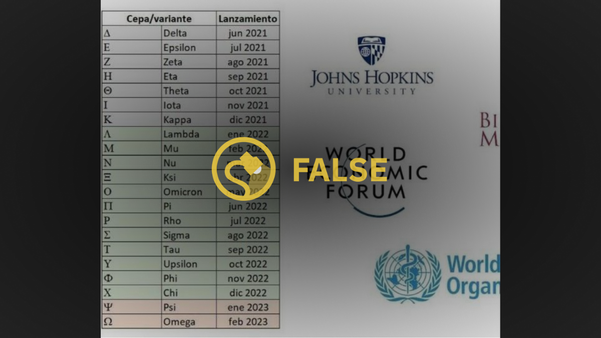
As a the highly contagious delta variant of the novel coronavirus caused infection surges in July 2021, Snopes readers contacted us about a chart circulating on social media supposedly showing when future strains would emerge.
In several places online, the chart was framed as evidence of a nefarious plan by unspecified forces to discuss COVID-19 variants on a predetermined schedule. The table included a column labeled "Cepa/variante" — the Spanish words for "strain/variant" — and another titled "lanzamiento," which is Spanish for "launched." Underneath the columns were letters of the Greek alphabet and the months those alleged variants would appear in news reports.
"These are the PLANNED COVID-19 VARIANTS - just look at the dates when they will be 'released' to the media," one tweet claimed.
In short, the image was bogus. However, similarly to most conspiracy theories, it was based on a small nugget of truth: All viruses' genetic codes mutate over their lifespan — which meant that strains of SARS-CoV-2, the virus that causes COVID-19, would indeed keep surfacing in the future — and the World Health Organization (WHO) does label new viral strains after letters of the Greek alphabet.
Let us elaborate on that former concept. Even in the early days of the pandemic, epidemiologists were tracking various strains of SARS-CoV-2 to see how they differed from the virus' original genetic code. The CDC summarized the process like this:
If you think about a virus (SARS-CoV-2) like a tree growing and branching out; each branch on the tree is slightly different than the others. By comparing the branches, scientists can label them according to the differences. These small differences, or variants, have been studied and identified since the beginning of the pandemic.
And since the variants' scientific names are complicated (they note their genetic lineages), the WHO adopted the Greek alphabet classification system as an "easier and more practical" way for everyone to talk about the variant strains.
For examples, variants that emerged in the United Kingdom and South Africa in late 2020 were dubbed "alpha" and "beta," respectively. And as of this writing, public health officials were ringing the alarm on the "delta" variant, a mutation that was up to 60% more infectious than previous SARS-CoV-2 strains.
(On July 27, due to infection surges, the U.S. Center for Disease Control and Prevention (CDC) recommended all people — regardless of their vaccination status — to wear masks indoors in communities with high transmission rates. Most new COVID-19 infections in the U.S. were among unvaccinated people, and studies showed existing inoculations prevented most recipients from getting sick from delta.)
Now, let's address some errors in the chart's alleged future-telling. For starters, it claimed "delta" would be "launched" in June — in reality, the variant was first detected in India in December 2020, and the first U.S. case was diagnosed in March. The purported timeline made similar errors (said 'X' variant would surface in 'Y' month that hasn't happened yet) when actually a strain with that name already existed.
To make our point, compare the viral chart to a sampling of variants on the WHO's website displayed below. Under the pretenses of the alleged timeline, "eta" would begin circulating in September and "iota" would begin infecting people in November — however, those variants were first detected in March and already circulating.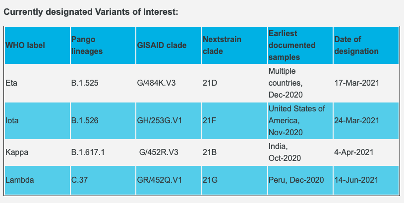
Note: Some variants of SARS-CoV-2 were barely different from the original virus, while others such as delta, included significant alterations in their genetic code that changed how they spread or attacked hosts' immune systems.
Next, let us address the image's misleading design. Logos for agencies leading COVID-19 research, such as the Johns Hopkins University, the World Economic Forum, and the WHO, were positioned next to the chart, as if it originated from those credible institutions. However, that was not the case. No evidence links the groups — nor anyone else in the science community — to the alleged timeline.
There was, however, ongoing research by reputable scientists to try to predict how, and by what rate, new COVID-19 variants would surface in the future. (According to Ed Feil, a professor of microbial evolution at the University of Bath, epidemiologists know the SARS-CoV-2's genome typically acquires one or two mutations a month on average — a rate that is about four times slower than the mutation process of the influenza virus.) But, unlike the chart appeared to do, that type of forecasting could not be turned into a simple month-to-month table. Feil said of predicting COVID-19 variants in May:
"Predictions about the evolutionary course of the virus, and specifically changes in virulence, will always be riddled with uncertainty. The vagaries of randomly mutating RNA, chaotic patterns of transmission and expansion, and partially understood forces of natural selection, present challenges to even the most insightful evolutionary soothsayer."
In other words, if credible scientists were facing an uphill challenge to try to predict the random, naturally occurring process of virus mutations, it was unlikely the unidentified creators of the viral chart had actually made the revelation first.
For the sake of playing devil's advocate, if the image's authors had actually mapped out the virus' evolution timeline, the chart would be eminently newsworthy. Reputable news outlets or journalists would be scrambling to corroborate the purported schedule and write headlines like, "Research shows a new COVID-19 variant will emerge every month for the next two years."
No such reporting was happening.
Lastly, it was unclear who, or what, exactly created the chart, though it was primarily circulating among people who shared this baseless belief: that unidentified evil forces were were trying to deceive non-believers into thinking the SARS-CoV-2 outbreak was a force of nature for their own gain.
"PLANdemic," one commenter alleged in a thread discussing the chart.
In sum, the image was nothing but a piece of misinformation in a wide-ranging, unfounded conspiracy that tech companies, journalists, politicians, and/or scientists were all coordinating together to undermine everyone else via COVID-19. For that reason, and those outlined above, we rate this claim "False."