
One of the more unusual features of the U.S. political system is the Electoral College process by which the president of the United States is chosen. Rather than holding a single, nationwide election in which the winner is the candidate who receives more votes than any other, the U.S. essentially wages 51 separate elections on the same day (one in each state, plus the District of Columbia), nearly all of them on a winner-take-all basis, with each state's results weighted by its population.
The Electoral College system has long been a contentious issue in American politics, especially so after 2016, when for the second time in five elections the winning candidate was not the one who received a plurality of the popular vote. Critics have called for its abolition (or modification) on the grounds that it's an 18th-century artifact that disproportionately magnifies the voting power of residents of smaller-population states, while supporters maintain the current system is necessary to ensure that successful presidential candidates foster popular support that is broad and national in nature rather than being tightly clustered in a few key areas.
An image macro popular on social media at the beginning of 2019 attempted to express that latter view, pointing out that the population of Los Angeles county alone — where residents voted for Democratic presidential candidate Hillary Clinton over Republican candidate Donald Trump by well over a 3-1 margin in 2016 — is greater that the population of a number of states in the U.S.:
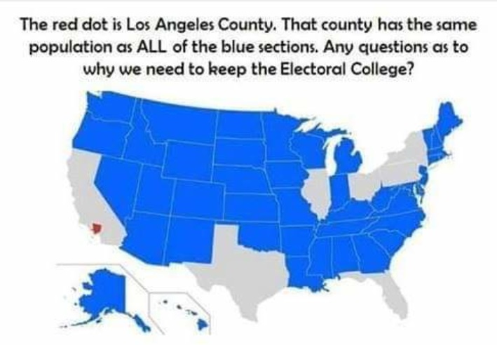
Whether the U.S. "needs" to keep the Electoral College is a subjective issue beyond the scope of this piece, but we can address a few of the factual issues related to this image macro.
First of all, the ambiguous wording of the text accompanying the image ("That county has the same population as ALL of the blue sections") has been misinterpreted by many viewers to mean that more people reside in Los Angeles County (represented by the red dot) than in all of the states colored blue on the map combined. That is not the case. The text means that the population of Los Angeles County is greater than the population of all but a handful of individual states. (For example, more people live in L.A. County than in the entire state of Washington, and more people live in L.A. County than in the entire state of Oregon, but the populations of Washington and Oregon combined are still greater than that of L.A. County.)
Second, population tallies are estimates, so the accuracy of the map's coloration is variable depending upon which source(s) are used for population figures. According to the most recent population estimates available from the U.S. Census Bureau for Los Angeles County (July 2017) and individual states, the populations of Georgia (10,519,475) and North Carolina (10,383,620) are slightly higher than that of Los Angeles County (10,163,507) so those two states should not be colored blue on the map seen above.
All in all the image macro makes its point fairly, even if it could be improved with some slight adjustments.