
In the final days before the 2020 presidential election, U.S. President Donald Trump accelerated his months-long campaign strategy to downplay the seriousness of the COVID-19 pandemic.
At rallies and on Twitter, Trump repeated claims that alleged a nefarious scheme on behalf of news reporters to undermine his reelection campaign by highlighting COVID-19 statistics — when, in Trump's reality, he wanted Americans to believe the country was "rounding the turn" on the deadly outbreak.
By pointing to alleged successes, ranging from the country's mortality rate to its testing levels, Trump sought to convince Americans his administration was making positive strides in curbing the virus' spread, and that the worse of the outbreak was over. With that messaging, he attempted to frame his Democratic rival Joe Biden as the candidate who would instead ruin the economy with strict lockdowns to curb the spread. On Oct. 30, Trump tweeted:
"Biden would lock us down forever. We are rounding the corner!"

Below, we determined the legitimacy of Trump's framing of the COVID-19 outbreak in the run-up before Election Day. We considered key metrics to which scientists point for measuring the outbreak's status: the rolling average in the increase in new cases and deaths each day, and mortality rates.
We based our analysis on COVID-19 patient information compiled by multiple sources, including the Centers for Disease Control and Prevention (CDC) and The COVID Tracking Project, to which local governments and health care systems refer, as of Oct. 30.
Claim: 'We Have the Lowest Mortality Rate in the World'
First, let let us define what a wave means during outbreaks of infectious diseases. When a fatal epidemic starts, a rising number of people fall ill and die, and that number grows until some sort of change occurs.
For example, as researchers deepen their understanding of a new disease, they can tell communities how to better protect themselves from illness — and those messages could stop rising case numbers and fatalities. Or, a disease may become less transmissible over time, people may grow immune, or scientists may discover new treatments.
If or when that type of change happens, the community would have tallied its all-time high record number of patients and deaths, and see a steady decrease in such measurements from then on.
But over the course of an infectious disease outbreak, that pattern — a rise in cases and deaths, a peak, and then a decline — often repeats. For example, the largest 19th-century epidemic of influenza, an outbreak that occurred between 1889 and 1892, consisted of three such waves, all of which varied in intensity.
Let's circle back to COVID-19, which is the disease caused by the coronavirus dubbed SARS-CoV-2.
The president alleged on multiple occasions, including at the final of two presidential debates with Biden on Oct. 22, that the country's "excess mortality rate is way down, and much lower than almost any other country," without further explanation.
But in reality, epidemiologists are still developing definitive estimates for the country's rate of excess mortalities — or the number of COVID-19 patients who died, in part, due to the virus exacerbating pre-existing health problems. "Data are incomplete because of the lag in time between when the death occurred and when the death certificate is completed," according to the CDC.
Rather, to measure the pandemic's deadliness, scientists often referred to what's called the "observed case fatality ratio," or the percentage of people who were testing positive for COVID-19 and dying within the sum of all positive cases.
As of this writing, that proportion was 2.6% in America — the seventh-highest rate among hardest-hit countries globally, per Johns Hopkins data. Czechia held the top spot, followed by India and Poland.
Additionally, to determine a country's ability to contain the virus, researchers considered the number of COVID-19 deaths per 100,000 people, healthy or not.
In the days before the election, almost 70 people for every 100,000 in the U.S. were testing positive for COVID-19 and dying — a rate that was the fifth worst death globally, according to Johns Hopkins data. Comparatively, Indonesia had the lowest death rate among countries most impacted by the virus, with roughly five deaths per every 100,000 people.
All of this said, an October study published by the Journal of the American Medical Association compared America's death rates — including preliminary estimates of excess mortalities in the U.S. — with that of 18 countries with similar economies and confirmed the findings of the Johns Hopkins data: the U.S. had one of the highest rates of deaths per 100,000 people. The researchers determined:
Compared with other countries, the US experienced high COVID-19–associated mortality and excess all-cause mortality into September 2020. After the first peak in early spring, US death rates from COVID-19 and from all causes remained higher than even countries with high COVID-19 mortality.
In other words, it was outright false to claim the country had the lowest case-fatality ratio globally, or the lowest rate of deaths per 100,000 people, and the CDC was still analyzing that data to form definitive estimates for the country's excess mortalities.
Claim: Fewer COVID-19 Patients Were Dying
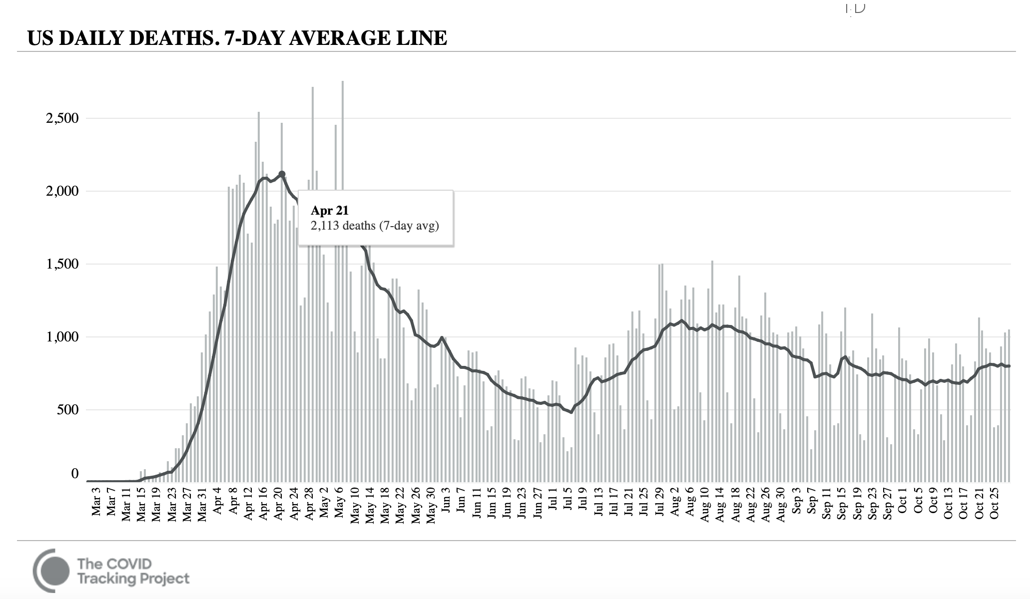
There is some truth within the president's framing of the pandemic's death toll shortly before the election: The survival rate among severely ill COVID-19 patients in the U.S. appeared to be improving.
During mid-September and late October, the seven-day average of deaths per day hovered below 860, which was well below the peak of more than 2,100 in the spring, according to the tracking project. As you can see in the graph below, that statistic was on a downward slope since that high point with slight ebbs and flows, though it never fell below about 480 daily mortalities.
No evidence showed the virus was becoming less fatal over time, but rather that the medical community had improved treatments for severely ill patients, and that more younger people with lower health risks comprised that group. Dr. Leora Horwitz, director of NYU Langone’s Center for Healthcare Innovation & Delivery Science, told The New York Times for an Oct. 29 story on the dropping death rate:
We understand better when people need to be on ventilators and when they don’t, and what complications to watch for, like blood clots and kidney failure. We understand how to watch for oxygen levels even before patients are in the hospital, so we can bring them in earlier. And of course, we understand that steroids are helpful, and possibly some other medications.
Nonetheless, epidemiologists were preparing in the weeks before the presidential election for the raw number of deaths to increase as the country's seven-day rolling average of new COVID-19 cases (or the sum of the current day's increase plus the six preceding days' increases, divided by seven) increased — a trend we unpack below.
According to CDC models, between 3,900 to 10,000 people could die during the third week of November alone, raising the country's COVID-19 death toll to at least 243,000 people.
Claim: COVID-19 Cases Were Increasing Because of More Testing
Facing a crowd of supporters in Michigan on Oct. 27, Trump repeated what he believes is the reason for America's high number of COVID-19 cases compared to other counties. "You know why we have so many cases? Because we test more," he said.
Not quite. Directly equating the increase in cases to the increase in testing (or upward slopes in graphs depicting COVID-19 data) was a flawed argument that, in effect, removed the role of individual responsibility to make lifestyle changes to prevent the spread of the virus.
Without question, increased testing would reveal more positive cases — that’s the nature of probability, and partly the reason for the country's all-time high positivity rate in the spring (seen in the graph below).
However, in order for increased testing to be the sole reason for more positive COVID-19 tests among Americans, the proportion of positive tests (within the sum of tests) would have to decrease, or remain steady, over time. And looking nationally, this measurement, called the "positivity rate," was on a slight upward climb in the final weeks before the 2020 election, according to Johns Hopkins data.
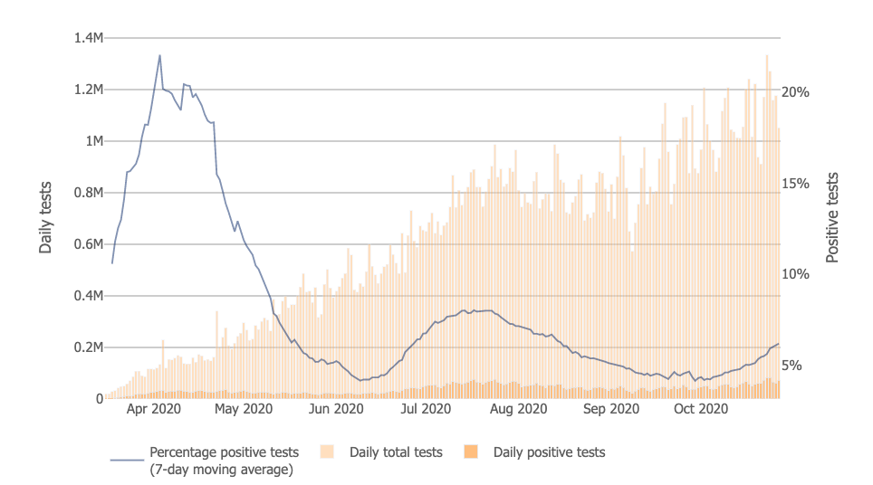
Over the course of several weeks before the election, the country's moving average rate of positive tests increased from 4.2% to 6.3%.
Per the World Health Organization (WHO), an area's positivity rate should remain at 5% or lower for at least two weeks before its leaders lift rules on social distancing. As of this writing, just 17 states met that threshold.
"The data speak for themselves," said Fauci, a leading member of the White House coronavirus task force, in an interview with BBC, where he described some states' high positivity rate as an indication the country was going in the wrong direction.
Claim: 'We Have Great Numbers'
After all, the Trump administration listed "ending the COVID-19 pandemic" as one of the president's top accomplishments in a campaign flyer on Oct. 27, according to a copy obtained by Politico and displayed below. A spokesperson for the White House later told Fox News the statement was "poorly worded" and meant to emphasize the administration's goal to overcome the pandemic.
Alleging success was undoubtedly a key reelection strategy for Trump. The day after the Michigan rally, for example, Trump went to Bullhead City, Arizona, where he said: "We have great numbers, we have some incredible numbers," in reference to the COVID-19 outbreak.
While he did not explain to what statistics, exactly, he was referring, nor highlight any specific evidence to support his claim, his supporters interpreted the comment to mean the pandemic was less of a problem in the fall than during the spring and summer months.
For the purpose of this report, we considered "great numbers" to mean the U.S. had hit its peak case total and was seeing a steady decrease in positive tests since then — or that the country was completing a wave.
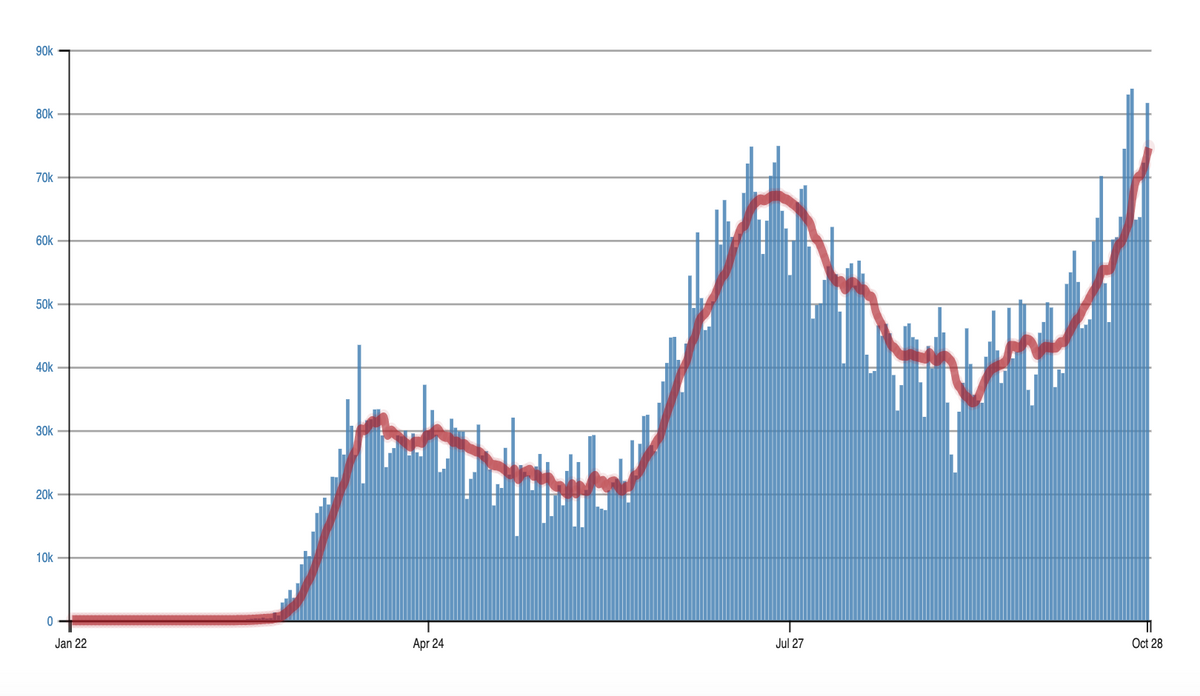
With that background in mind, consider the country's seven-day rolling average of new COVID-19 cases and deaths (or the sum of the current day's increase plus the six preceding days' increases, divided by seven), which researchers consider one of the most reliable indicators of the country's pandemic status.
As you can see in the graph below, which was a compilation of data by Johns Hopkins, the rolling average had steadily increased since the beginning of the U.S. outbreak, with two slight dips in summer and fall.

For purposes of checking this claim, let us narrow in on the weeks before the November election.
Between mid-September and late October, the seven-day average of new cases was rising from a trough — as you can see in the below-displayed graph via The COVID Tracking Project, to which governments and health care systems refer for developing COVID-19 plans.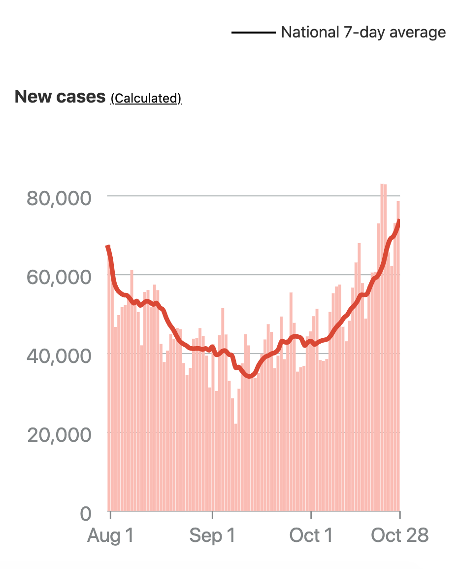 That meant the number of new COVID-19 cases from one day to the next was increasing — not decreasing (which would show a downward slope), nor remaining stagnant — when the president suggested otherwise. In fact, the rolling average reached a record high in late October, when the country tallied an average of more than 70,000 new cases daily and Trump alleged progress containing the virus.
All of this said, the country's rising cases never showed a downward slope that signified an end of a wave in infections. In the words of Fauci, director of the National Institute of Allergy and Infectious Diseases (NIAID), the country in October was experiencing an "exacerbation of the original first wave" of COVID-19 cases.
Claim: 'We're Rounding The Turn'
To determine whether the country was overcoming the pandemic, let us recap the above-explained trends:
- Nationally, the rate of positive tests was steadily increasing, and most states surpassed the WHO's 5% threshold for when government could begin easing restrictions on social distancing.
- The average rate of daily COVID-19 deaths was remaining fairly stagnant, hovering below 860.
- The U.S.'s average number of new cases per day was increasing — not decreasing.

But that data did not include the rolling average of new COVID-19 cases on a state-by-state basis — rather than nationally — which was among the strongest measurements of the country's progress.
As Lisa Maragakis of Johns Hopkins explained, "the spread of the coronavirus so far has been more like a patchwork quilt than a wave," with the virus wreaking havoc to varying degrees in different areas at different times.
In other words, if most states had curbed the spread of COVID-19 and reduced their number of new daily cases since the start of the outbreak, while populous states did not, the nation's moving average would not reflect the majority of the country's progress, lending some credibility to Trump's claim that most of the country was making positive steps.
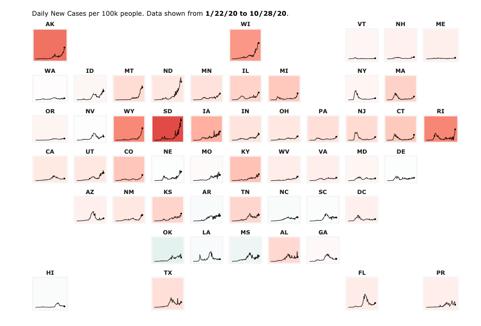
That was not the case, however. Less than a dozen states were tallying a downward trend of new cases per 100,000 people, as of late October, according to Johns Hopkins data. As seen in the below-displayed graphic, states in shades of orange were experiencing a surge in new cases as of late October, and states in shades of green were seeing a decline in new cases. The darker the shade, the bigger the change.
Another compilation of the tracking project's data by The Washington Post came to the same conclusion. The graphics below showed how the pandemic progressed in summer and fall by comparing the daily rates of new cases to each state's peak, or its highest increase in new cases for one day.

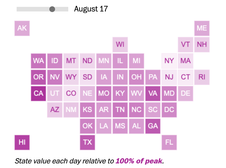

As you can see, most states' trajectories appeared to be worsening rapidly. "We see no evidence that any state in the current surge has reached its peak and begun to decline," the COVID tracking project tweeted on Oct. 29.
Here's the bottom line: The outbreak was far from under control — no matter what each presidential candidate claimed in their final pitches to voters.
"We should have been way down in baseline and daily cases, and we're not," Fauci said, while speaking with the the Journal of the American Medical Association.
In sum, scientists as of this writing were expecting the rolling average of new COVID-19 cases to continue to climb, with no indication that they had peaked or would begin to decline. So by describing the country as "rounding the turn" on COVID-19, the president was blatantly mischaracterizing actual COVID-19 data. For that reason, we rate this overall claim "False."