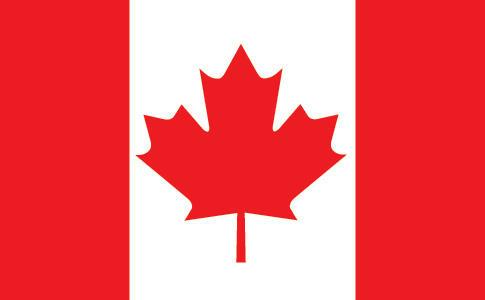

In the lifetime of anyone younger than about fifty, the Canadian flag has always been its current simple, yet bold and distinctive, red-and-white maple leaf design. And those who weren't around for the Canadian flag debate of the mid-1960s may find it difficult to believe how controversial the adoption of this seemingly innocuous flag truly was; how contentious and divisive a move it was for Prime Minister Lester Pearson to stand before a Royal Canadian Legion convention in May 1964 and say: "I believe most sincerely that it is now time for Canadians to unfurl a flag that is truly distinctive and truly national in character; as Canadian as the maple leaf which should be its dominant design, a flag easily identifiable as Canada's; a flag which cannot be mistaken for the emblem of any other country; a flag of the future which honours also the past; Canada's own and only Canada's."
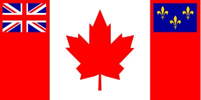
At the time of Confederation in 1867, Canada's official flag was the Royal Union flag, commonly known as the Union Jack. Over the course of the next century, the Red Ensign — a red flag with a Union Jack in the canton and the Canadian coat of arms in the fly — became the de facto (if unofficial) Canadian flag:
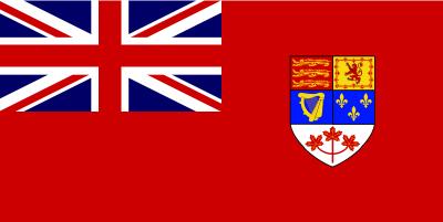
(Not until 1924 did an order-in-council sanction the flying of the Red Ensign from Canadian government buildings abroad, and another twenty years elapsed before a second order-in-council authorized its use on federal government buildings within Canada.)
As the issue of a new national flag for Canada was raised anew in 1964, all the usual difficulties involved in choosing a suitable design resurfaced. What kind of flag could both honor Canada's historical past, look forward to its future, and appeal to a majority of modern Canadians? What elements would satisfy Canadians of both English heritage and French heritage, as well as those who were neither?
Given how starkly Canadians were divided along demographic and ethnic lines, the chances of reaching a consensus on a new national flag often seemed hopeless. Many English Canadians, particularly those born before World War II, wanted to retain the Red Ensign to preserve both tradition and a visible symbol of Canada's British heritage, while many French Canadians were opposed to (exclusively) retaining colonial symbols such as the Union Jack. The roughly one-third of Canadians who were neither of French nor British lineage tended to prefer a flag that was uniquely Canadian, and younger Canadians (those born after World War II) were likely to opt for something new and different that completely broke with the past.
After weeks of parliamentary debate, the flag question was finally referred to a fifteen-member, all-party committee in September 1964 — a risky move, given that twice before (in 1925 and again in 1945-46) committees tasked with choosing a new Canadian flag had been derailed by political squabbling. Over the next several weeks, the Flag Committee sifted through about 2,000 designs that were submitted to them directly, as well as another 3,900 or so that reached them through other means (including designs considered by a previous parliamentary flag committee in 1946). As author Rick Archbold noted:
Many of these flags bore Union Jacks and fleur-de-lys. Quite a few featured a beaver, including one wearing a Mountie hat; another one showed an adult beaver encircled by ten smaller ones (Canada and its provinces). Other wild creatures included Canada geese, grizzly bears, moose, salmon, bison, caribou. The North Star was a popular emblem, as was the cross. Several designs included aboriginal symbols. And one, submitted by the self-proclaimed "Society for the Suppression of Blue Lines" of Toronto, consisted of "crossed red hockey sticks rampant" and a single hockey puck.
A major hurdle was settling on a central representative symbol for Canada that would meet with the approval of most Canadians. A beaver was a popular choice, but it proved unsatisfactory for reasons described by Archbold:
The beaver was in many ways lacking as a potential national symbol. Graphically it makes an awkward image. Apart from being regularly skinned for profit, it is most noted for its engineering prowess. But the beaver is also a destructive creature, seen as a pest by those trying to clear and settle the land. It creates swamps where they are not wanted and consumes useful hardwood. Besides, why would a self-respecting country adopt a rodent with buck teeth and an outlandish tail — a cartoon animal that, some allege, consumes its own testicles when threatened and occasionally forgets to get out of the way of a tree it has felled — as the image it projects to the world?
Sir Sandford Fleming put it even more caustically back in 1893, when he observed that "There are other members of the same natural order (Rodentia), such as rats and mice, not less active and industrious than the beaver, and for this quality alone no one would dream of selecting one of these vermin for our national emblem."
The sugar maple leaf was an obvious choice as a symbol that had long been used to represent Canada, but even that option had its detractors. Former prime minister John Diefenbaker protested that with a maple leaf flag motif incorporated the flag would convey "no recognition of history; no indication of the existence of French and English Canada [or] the partnership of the races; no acknowledgement of history." Other critics complained that the maple leaf was not a truly national symbol because the sugar maple tree did not grow west of the Ontario/Manitoba border, and that "the maple leaf flag is neither [unmistakably Canadian nor a unifying force]. Its only advantage is that it is innocuous; that it produces tepid approval, mild disapproval, or indifference; that it can therefore be adopted without any display of strong feeling whatever."
But, as Rick Archbold observed, the innocuous nature of the maple leaf also made it a highly appealing and powerful symbol for a new Canadian national flag:
When you think about the sugar maple leaf, you begin to understand how it won almost by default. Among our native trees, it and the oak carry perhaps the most ubiquitous and distinctive leaves, shapes instantly recognizable and easy to remember. But the maple leaf is more symmetrical than the oak and turns bright red, not dingy brown, each fall.
The real plus for the maple leaf was its very lack of an established personality and its innocence of mythic or commercial associations. At a time when fierce tribal and religious loyalties repeatedly threatened the survival of the young dominion, anyone could look at the maple leaf and see an unassuming, neutral symbol that posed no threat to his or her identity or interests. Maybe the maple leaf emerged at the top of the symbolic heap because it was the perfect, perhaps the prototypical, Canadian compromise.
After several weeks and thirty-five sessions, the Flag Committee finally narrowed its choices to fifteen designs, which were grouped into three categories: designs incorporating a three-maple-leaves-on-a-stem motif, designs featuring a single maple leaf, and designs incorporating "symbols of other countries" (the Union Jack and the fleur-de-lys). Via a "mind-numbing series of secret ballots," the committee then selected a single design from each category to put to a final, sudden-death secret ballot: The so-called "Pearson Pennant" (a three-leaf design favored by Prime Minister Lester Pearson), a flag with a single stylized maple leaf, and a similar single maple leaf design which also incorporated the Union Jack and the fleur-de-lys:
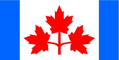
The Pearson Pennant looked too much like a Liberal Party flag to be acceptable to a majority of the committee members, and the third finalist was regarded as an ungainly compromise that pleased only the Tories, so the single stylized maple leaf motif won the day. After a month's cooling-off period, the House of Commons took up the final stage of the flag debate at the end of November 1964. Despite a fourteen-day filibuster by disgruntled Tories, the flag issue was finally put to a vote on 15 December 1964, and the Flag Committee's recommendation was accepted by a vote of 163 to 78. Two months later, on the morning of 15 February 1965, the Red Ensign was officially lowered for the last time from a special flagstaff erected in front of the Peace Tower on Ottawa's Parliament Hill, and then, on the stroke of noon, the red-white-red rectangle with a maple leaf was raised in its place. Finally, Canada had a new flag.
The urge to find additional, hidden meanings in national symbols is a powerful one, and in the years since the adoption of the new Canadian flag, claims have been advanced that the number of points (11) on the stylized maple leaf it features has a special significance: It represents the Canadian provinces and territories (one point for each of the ten provinces, with an extra point for the territories), or it represents ten provinces and one country; or it represents Canada's eleven governments (ten provincial and one federal):
There's been some speculation that the eleven points on the maple leaf on the flag of Canada, nine above and two below, stood in some way for the number of provinces and territories in Canada. Others have speculated the 11 points represent 10 provinces and one country, but again, this is only rumour.
These claims are all a bit contrived (Canada had two territories when the maple leaf flag was adopted, and the territories themselves have governments as well), and they are easily dismissed.
The design shown above that was selected as the Flag Committee's recommendation isn't quite the design that was ultimately adopted, for it bears a maple leaf with thirteen points. That the final version featured an eleven-point leaf was coincidental rather than intentional, the result of a slight modification undertaken during the cooling-off period between the committee's final decision and the beginning of parliamentary debate:
[Flag Committee member John] Matheson liked [designer Jacques] Saint-Cyr's proposed thirteen-point leaf, a symmetrical shape which would make the two sides of the flag match perfectly. It was stylized but still evocative of the sugar maple. Hastily silk-screened in [federal commissioner of exhibitions John] Reid's department, this prototype was hoisted up the flagpole at 24 Sussex Drive togreet Prime Minister and Mrs. Pearson with their breakfast on the morning of November 7.
But there was something wrong with the thirteen-point design. To figure out just what the problem was and how to fix it, the three men met that evening in one of the longer hallways at Reid's headquarters. The length of the hall would allow them to get far enough away to see how it showed up at a distance. The three of them rushed up and down the hall to confer and look at each of Saint-Cyr's latest sketches.
"Do you think maybe it's too busy at the base?" Reid asked after they'd been at this for some time. "What would happen, for example, if you took away two of the four points?"
The light bulb flicked on. Saint-Cyr immediately set about modifying his design, and within an hour he had a finished sketch that all three men approved. They then took this refined leaf to the Commission's silk-screen shop, where late that night three prototypes of the eleven-point design were produced. On November 9 Pearson gave his blessing. Cabinet endorsed the design soon after.